
There are over 1.5 billion websites on the world wide web today. To have an outstanding blog within the online universe, you absolutely need a simple, but efficient blog design. Check out the following blog design tips.
In unanimity, marketers agree that content is king. Still, if you don’t have a user-friendly interface and easy navigation menu on your blog, you are creating obstacles for your user to access the fantastic content that you created.
It’s the design that makes the content look attractive to readers. After all, what’s the point of having excellent text if it’s not well-presented and easy to read? A successful blog design does not rely only on the beauty of images and design, but also on a simple and intuitive browsing experience for the users.
Let’s Make Your SEO & Content Work Better for Your Business
Just a quick head up here: all the info presented here applies to web design in general and to blogs in particular.
Here are the most important tips that we selected for you to use on your blog design, so you maximize the results of your content strategy, user experience and conversions.
Keep up!
Blog Design Tips: Don’t Get Lost in Too Many Colors and Fonts
There are some websites and blogs out there that love to vary in colors and fonts. However, such diversity can confuse the user and hinder the construction of a visual identity.
Your website or blog is an extension of your business. Therefore, the color palette chosen should correspond to the colors of the brand. Consistency is the key to building a recognizable brand, and when all your materials combine or complement each other, it facilitates your business perception.
If you are not familiar with the most common color meanings, here are some examples of feelings that the main shades may evoke:
● Red: energy, passion, emotion, power, aggression, danger.
● Blue: coldness, spirituality, freedom, patience, loyalty, peace, confidence, sadness, depression
● Yellow: light, optimism, happiness, brightness, joy.
● Green: life, nature, serenity, health, wealth, prosperity, decay, toxicity.
● Orange: Friendliness, cordiality, accessibility, energy, cheerfulness, courage.
● Violet: wisdom, sophistication, celebration, nobility.
● White: purity, cleanliness, youth, freshness, peace.
● Black: power, elegance, secret, mystery.
● Gray: safety, maturity, reliability.
● Rose: romance, femininity.
● Brown: comfort, strength, stability, credibility.
Concerning colors, it is highly recommended to employ a palette with a maximum of 3 or 4 colors that are harmonious and complementary with each other and consistent with the company’s brand colors.
Check out the example below: this is a website of a brass gifts supplier. The brand identity has only 3 colors, which keeps it clean and straightforward. Also, the yellow helps direct the attention to the conversion touchpoints (we will explain in more detail soon).
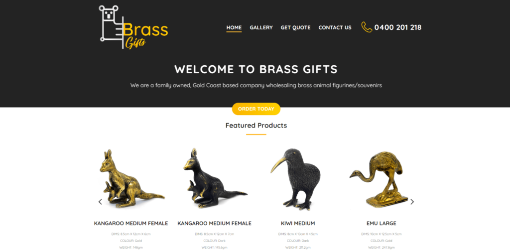
Source: BrassGifts
By the way, some tools can suggest ready-made color palette variations for your blog according to the combination of the different styles. Such tools are Adobe Color or ColourCode.
The same goes for the fonts: maintaining the same standard will help maintain brand unity and cohesiveness. Use between 2 or 3 legible fonts to make your content and message easy to read and to conserve the main style from this point of view.
It’s a reliable idea to choose, for example, a font type for titles – H1, one for text, one for menus, and if necessary, one for the blog sidebar or promotional materials.
Anyway, concerning both colors and fonts, the best rule is to aim for simplicity. As always, remember less is more!
Blog Design Tips: Keep It Simple
Launched by Bauhaus, an art school founded in 1919 in Germany, this concept is still valid today, especially when it comes to website design.
Your website design should prioritize the essentials: it needs to be light and easy to interpret. Thus, avoid a layout displaying many distractions, visual pollution, unnecessary elements, and animations.
You have a few seconds to capture the user’s attention, so the most recommended is to use a clean, elegant, direct, and objective layout. Keep your focus on the most important and relevant points of your business, with light pages, well-positioned elements, and smooth navigation.
Source: Youtube
Blog Design Tips: Speed Up Page Loading
As already mentioned, the design also has to do with the accessibility of the pages. And there is nothing more important than loading speed.
Slow pages cause frustration for visitors and web designers alike. It proves to be an annoying experience for everyone. But what causes pages to load slowly? It’s usually heavier images, scripts, and code that make a site longer to open.
To find out exactly what happens on your site or blog, do yourself a favor and use some tools that measure page weight and speed, like PageSpeed Insights.
This platform is useful because they point out exactly the slower pages and elements that can be improved.
Visuals are the first vector of sales.
Use Professional Styled Stock Photography to Promote Your Business.
Blog Design Tips: Visually Highlight CTAs
One of the major points where design and usability come together is the famous call-to-action (CTA).
If you pay attention, you will see that every day we are impacted by different calls in different environments.
“Push”
“Open”
“Come in, Air Conditioning”
“Smile you are being filmed”
Or even the green light of a traffic light…
All these signals exist to indicate what we should do in that context or how to interact with a particular object.
The online world is no different!
Calls to action fulfill the function of guiding the user to perform in the desired direction, such as subscribing to a newsletter, downloading exclusive material, or adding to the cart. Therefore, they need to stand out in the layout to catch people’s attention.
From opening a page (or looking at an ad) to the moment we decide to take action, we go through different steps (AIDA marketing model). Each of these steps requires proper care. Therefore, your site must be prepared to meet the specific objectives of each step:
● Attention: When we get the exclusive focus of a visitor and keep them browsing.
● Interest: Gaining attention, the visitor has the first impression of what they are looking at and decides to look for more information about the offer.
● Desire: At this time, a more detailed analysis of the offer is made, looking for its benefits and features to make sure it meets your needs.
● Action: Finally, with the decision made, the conversion action is performed.
Calls to Action are very useful tools mainly in the Attention and Interest steps (which last a few seconds) and in Action, which is often the very act of clicking on the CTA.
Ideally, CTAs should have colors that stand out from the background on which they are inserted. For example: on a blue banner, a yellow CTA button would stand out visually.
Besides the color, there is also the question of how to position the CTA on the screen. Depending on the size of the page and its content, a best practice is to repeat the CTAs so that they are always under the viewer’s eye.
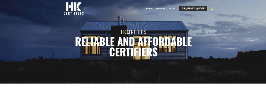
Moreover, it is vital to have an action verb on your call to action. Look at the example below. This website is a private certifier, and the CTA is clear and always visible in the header.
Blog Design Tips: Privilege the User Experience
Organizing the information hierarchically is essential so that visitors can intuitively and fluidly “walk” through the content of your site.
When you go to a video site like Netflix, for example, you want to find a comedy movie. You intuitively click on the movie’s menu, then on the genre, and finally on comedy. After landing in the broad category (Comedy), Netflix will show you sub-categories, such as romantic comedy or international comedy. The same logic path is followed when you want to buy a Blu-ray of the same movie at a physical store, and you pursue a hierarchical order of information.
People will always look for logical patterns when looking for content, and your site needs to be optimized for it.
Consequently, create a map for your site. Create an organization chart and simulate the path that the visitor would take on your website from the moment they land and place yourself as a guide that will direct them so that they do not get lost on the way.
In the context of information architecture, taxonomy refers to the names we give to the group and describe the contents, as well as the language we use for this purpose.
Also, list the categories of posts. The idea is to create the minimum amount necessary to cover all matters in your niche market. Don’t create very specific sections, so that they don’t run out of content.
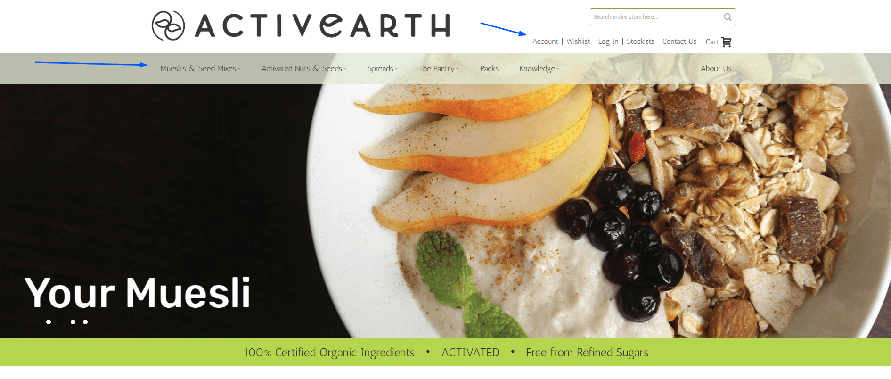
Let’s see an example. This is a website that sells activated nuts online and many other organic ingredients. Observe that there are different categories related to the products, and the info about the company and account are on a different menu.
Although information architecture is a broad subject, in practice, you will need to perform four basic tasks to organize better your blog or website:
● List and rank your website sections.
● Name each section.
● Create a website map.
Conclusion
Less is more! This is the quintessence of blog design tips: keep the colors, fonts, menu bars, and other visual elements as simple and consistent along with the website or blog as much as you can. Make sure that you give directions to your visitors. Make their time on your blog easy and enjoyable!

Invited Guest Author:
Gabriela Damaceno is a journalist and head of online content for Media Shark, Gold Coast digital agency. She is representing Adco Industries Australia, a wholesale safety knives supplier. You can connect with her via Linkedin.
